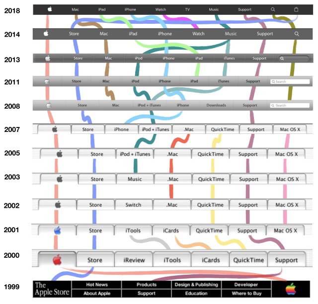
What Apple’s nav bar evolution says about the company

Remember iReview or iCards?
Those tools once occupied coveted space atop one of the 100 most-visited websites in the world: Apple.com.
Both were short-lived products.
Most changes to Apple.com are gradual. Rather than a splashy periodic redesign that overhauls everything, the site tends to evolve so gently that changes are barely noticeable.
A cursory review of the past twenty years of Apple.com’s menus (thanks to Archive.org) tells us several things about the company.
• The nav bar reflects the company’s priorities. The Apple TV received a place on Apple’s nav bar in 2015. The device itself, however, has been around since 2006. Back then, Apple called it a “hobby.” Now the company’s much more serious about tvOS and creating content. Buttons also shift left or right on the nav bar as Apple’s focus on individual product categories waxes and wanes. The iPad was introduced as just another product after the iPhone, the iPod, and the Mac. As Apple became serious about positioning the device as the future of computing, iPad snaked to the front of the line.
• Apple has shifted from promoting software to hardware. In the early 2000s, iReview, iTools, iCards, QuickTime, Support, .Mac, and Mac OS X made up the bulk of Apple’s navigation. Today it’s all about products: Mac, iPad, iPhone, Watch, and TV. Apple also tends to keep hardware on the left and software on the right. One of the victims in the shift away from featuring software is iCloud. iCloud’s primitive predecessor, .Mac, reigned on the nav bar for five years. iCloud is much more significant but under-utilized in the browser. 

• Apple tends to sneak in site changes during product launches. The biggest modern change – the site’s conversion from pinstriped tabs to solid gray buttons – occurred when Mac OS X Leopard was announced at Apple’s 2007 Worldwide Developers Conference in Washington, D.C. Product announcements always overshadow site changes.
• Apple is shifting to icons to fit more in navigation. The search field has shrunk to a magnifying glass and the store has been reduced to a shopping bag. The need to fit more items is indicative of the growth of Apple’s product categories. The nav bar has expanded from seven buttons in 2000 to ten today.
• What’s old is new again. Apple’s jet black 1999 nav bar gave way to pearly white, then four increasingly darker shades of gray before returning to sable. The music tab has come full circle. It surfaced in 2003, became iPod + iTunes for a few years, split into two tabs, then merged back into a singular music tab.
• Throughout the years, the three stalwarts are the Apple logo, the store and the support tab.
• 2002 was the only time Apple put a marketing campaign in its top navigation: the Switch tab (remember “I’m a Mac/ I’m a PC”?).
• Apple’s navigation in 1996 and 1997 was a vertical sidebar (pictured right) which included a few buttons you wouldn’t expect to see at the top of Apple’s site today, like “Register to Win.”
Send your questions and feedback to hkeely@reviewjournal.com and follow me on Twitter: @HarrisonKeely.