2021 colors of the year quite diverse
Every fall, color experts and paint manufacturers reveal an exclusive color of the year. In the recent past, you could count on seeing a lot of grays and some attempts at finding the perfect accent for them. But after an unprecedented 2020, the 2021 selections are all over the board: red, blue, green, gold and more.
“Each year colors are chosen based on a variety of factors. One of those is the basic disposition of society itself. The current … mood is fundamentally frustration and fear,” said Dak Kopec, an architectural psychologist and the coordinator for UNLV’s Master of Design Program. “What is interesting about the colors for 2021 is that they’re mixtures as opposed to primary colors. Mixtures add a level of complexity which is a reaction to boredom.”
Jill Abelman, owner of Las Vegas interior design firm InsideStyle, calls this year’s many unique colors “varied and bright” and sees how they connect with the social mood.
“I personally think (this) correlates with our need for some uplifting news and hope right now. The pandemic has put a damper on everything and brighter colors are mood changers,” she said.
Here, experts discuss some of this year’s color selections and where you might use them in your home in 2021.
Pantone’s two-color take
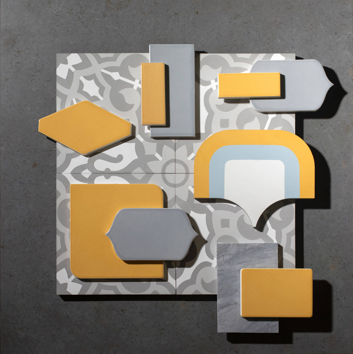
The Pantone Color Institute is perhaps the highest-regarded group of color experts in the world. This year, the institute’s choice was a strong departure from last year’s Classic Blue. It chose two colors instead: Ultimate Gray and Illuminating (a yellow).
“Yellow has long been associated with good health in multiple cultures. Yellow is about happiness, light-heartedness and fun in the sun,” Kopec said. “Gray is almost completely opposite. Dismal, sleepy, reflective and sadness.”
Together, however, the gray enhances the yellow to make it appear brighter, Kopec said, and you should reserve the yellow for smaller spaces, such as bathrooms and half walls in larger rooms. Yellow is also a good kitchen color.
Michele Aloe, Las Vegas showroom manager at Walker Zanger, a stone, cement and ceramic tile manufacturer, said the new Pantone gray is happier and not as dreary as past offerings.
“It works well in the Las Vegas midcentury modern homes along with the pops of yellow,” she said. “Some clients are doing full bathrooms in the yellow as well.”
Aloe also suggests weaving it into wall art and mosaics as an accent in dining and living rooms.
“With the yellow, it makes for a more lively space than just the grey and white we’ve been living with for so long,” she said.
Embracing aqua, teal
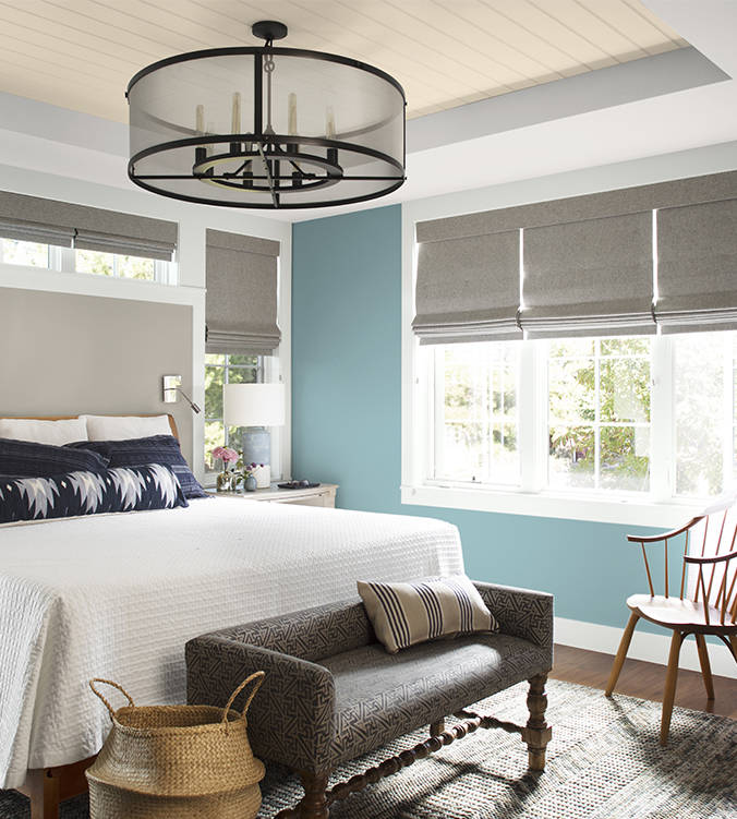
Some paint color experts embraced blue and green for 2021. Glidden’s accent color of the year is a little bolder than last year’s Whirlwind, a modest gray. This year, the company’s color pros chose Aqua Fiesta, describing it as “happy and muted” for those who love a softer green.
Abelman said Aqua Fiesta reminds her of something she might see at a trendy spa or oceanside resort in Mexico. Although it’s uplifting, she advises using the color sparingly, in a secondary bedroom or on an accent wall.
Benjamin Moore introduced a muted blue-green in Aegean Teal for 2021. Abelman calls it a “restful” color and added, “I could see it on a new kitchen remodel that has a bit of a throwback feel.”
For both of these blue-green combinations, Kopec advises white as a complementing color to help them stand out.
“We tend to see the teals and aquas on the lower portion of a two-tone wall or as fun geometric shapes … in bedrooms,” he said, adding they work well in small, darker areas such as bathrooms and hallways in combination with white.
Paprika, bronze
Some color of the year entries embraced bold reds and gold. Satin Paprika from Rust-Oleum and Urban Bronze from Sherwin-Williams are examples.
Satin Paprika anchored 10 color palette creations developed by Rust-Oleum. Customers and DIYers looking for a “feeling of well-being” is what drove the selection, according to Grace Khoury, Rust-Oleum brand manager. Kopec said both the bronze and paprika colors work well in home flooring and countertops.
“The larger the room, the more paprika and bronze will appear,” he said. “For example, a very large kitchen/great room might have solid bronze or paprika metallic stone, versus a smaller space just having bronze veins or spots set in an off-white or tan background. Larger kitchens can also accommodate darker (paprika) cabinets.”
Smaller kitchens might experiment with a lighter teal cabinet but add bronze or paprika knobs and handles, he suggested. And both Satin Paprika and Urban Bronze are also perfect for fixtures — think faucets, lighting and door handles.
Urban Bronze works well in modern farmhouse environments, Abelman added.
“I would utilize it on a kitchen island or in a formal room with lots of light-colored upholstery for contrast,” she said. “It has a very strong, pensive tone and should be used in rooms with a lot of natural light to keep it from feeling too heavy.”
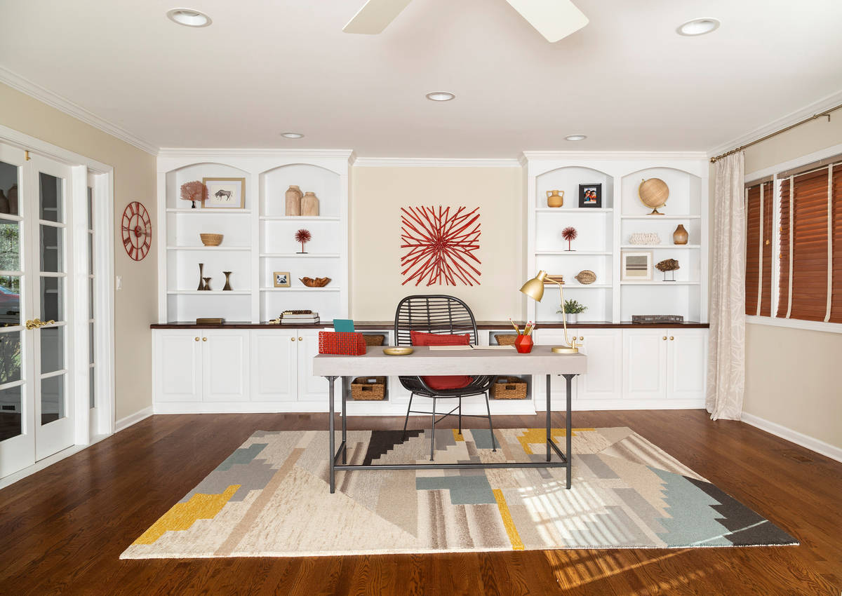
Aloe sees Urban Bronze as a popular option for trim, crown molding and baseboards and as an accent in stone tile, and on fireplace surrounds. Paprika can be mixed with yellows and grays too, she said. “It’s a little bolder and great for architecture elements like railings or the home’s trim.”
Designers often caution homeowners about how to incorporate red, but Abelman said Satin Paprika is a deep, rich color that may allow for a bolder approach.
“I like this color a lot. In fact, our master bedroom is very close to this tone,” the designer added. “Red adds a warmth and instant pop to whatever room you feel inclined to use it in. It works well for cozy spaces where you want to feel a bit more enveloped in color. It is also an active, passionate color and it can evoke hunger, which is why a lot of fast-food restaurants incorporate this tone.”
What Kopec likes most about this year’s colors is that they are “compositions of primary colors” so they stimulate, a departure from the flat gray modernism in recent years.
“Blues are associated with coolness and stability. Greens are often associated with health and growth. So, it’s not surprising that the teals and aquas would resonate with people,” he said. “(Bronze and Paprika) have foundations in reds and browns. Reds are associated with action and warmth, and browns are associated with being grounded and stable. … With these color combinations we see … society’s need for stability in health … while concurrently remaining grounded in ideas and conservative in risk.”


