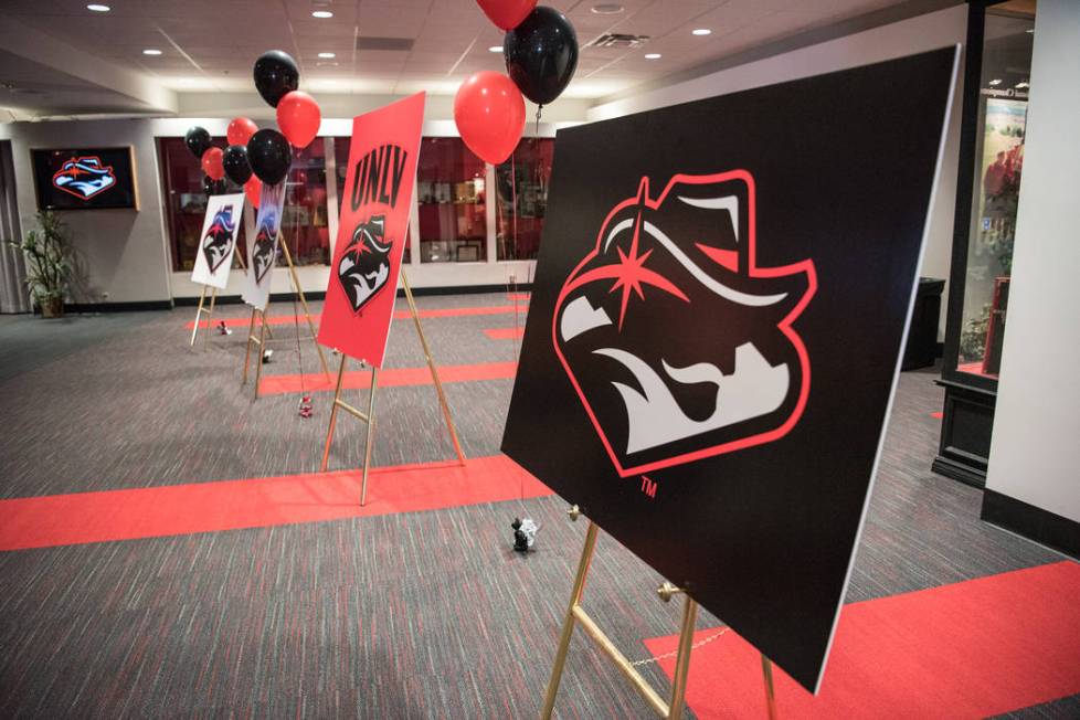
UNLV officials quiet since unveiling new sports logo

UNLV officials have opted not to comment since unveiling the university’s new sports logo Wednesday, an apparent attempt to hope the initial furor by Rebels supporters dies down.
If that is their strategy, it could go two ways.
It could work. Penn State introduced its logo in 1983, which to this day is derided even among many of its fans as a chipmunk because of its puffy cheeks. But the logo remains in place despite various efforts to replace it.
Or UNLV could run into a situation similar to what Saint Louis experienced. That university received such harsh criticism after introducing a new version of its mascot last year that the school worked with the community to give it another try. Then in January, the introduction of the new Billikens mascot went over considerably better.
Closer to home, a change.org petition had garnered more than 5,000 supporters by Friday afternoon urging UNLV to change its logo.
Social media was so abuzz after Wednesday’s announcement that the national media, including USA Today, took notice by publishing many of the critical tweets.
The most common critique is the logo is difficult to understand upon first glance.
In UNLV’s previous logo, which was updated in 2006, it was easy to see the Hey Reb! mountain man wearing a Western hat under the “UNLV” letters. That logo was popular among Rebels fans, but it also has been described by others as “cartoonish.”
Hey Reb! is in more silhouette form in the new look, which adds the star from the “Welcome to Fabulous Las Vegas” sign south of the Strip, as well as the neighboring mountains. UNLV officials pushed the idea that the logo represents a forward-looking university.
“I wanted something modern and strong, and I think that it conveys that,” UNLV president Len Jessup said Wednesday.
More Rebels: Follow all of our UNLV coverage online at reviewjournal.com/Rebels and @RJRebels on Twitter.
Contact Mark Anderson at manderson@reviewjournal.com. Follow @markanderson65 on Twitter.