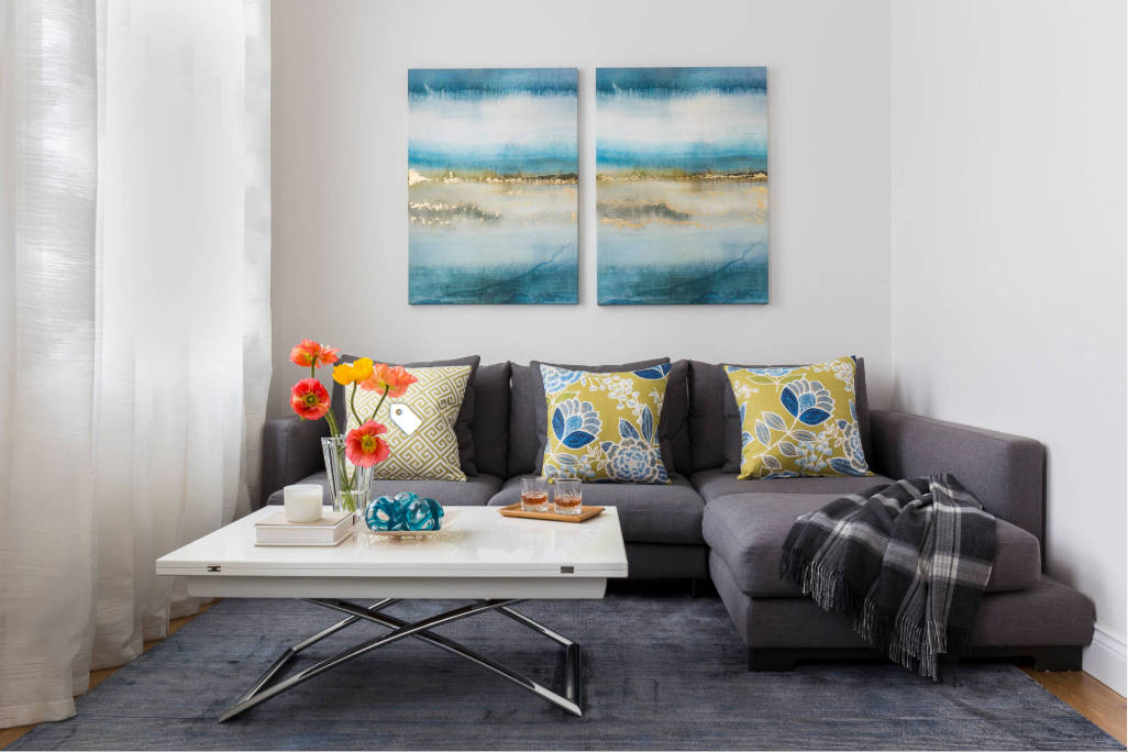
Regular-size furniture will oftentimes work in small space
“Always design a thing by considering it in its new larger context — a chair in a room, a room in a house, a house in an environment, an environment in a city plan.” — Eliel Saarinen (1873-1950), Finnish architect, in Time Magazine
Size and scale are important in almost everything in our lives — clothing, cars, houses and design to name a few. As a matter of fact, they are two of the most important aspects of good design or the keys to simply living easier in your favorite place. They create cohesion in your furnishings and provide great style in your home.
With few exceptions, every piece of furniture or art, each accessory, window treatment and every room layout is tied to scale and size.
We’ve all seen the photos of very scary rooms — not haunted — but totally out of sync: big rooms with not enough furniture creating big empty spaces; rooms where homeowners have lined the furniture up around the walls; or rooms that appear top-heavy or over-furnished.
One of the most prevalent size and scale rules you may have heard is the small room, small furniture one. Not true. In reality, regular size or even large pieces will more than often make a small space look larger. The size of the room may preclude the number of pieces you can use, but it shouldn’t dictate the size of those pieces.
So let’s look at some other examples of size/scale.
Artwork, for instance, should match the size and volume of wall space or furniture over which it will be hung. An 8-by-10-inch photo of your wedding, for instance, is not the proper fit to hang over your sofa. A grouping of maybe nine or 12 of them in a collage might work (but that’s a lot of forever after). When art and furniture are so badly matched, both lose their importance (remember, forever after).
And now let’s talk about accessories. I’ve never been a fan of little accessories. They’re kind of annoying, just take up space, and gather dust.
Big, bold accessories make a statement. Fewer are required, they’re easier to clean and, did I say, make a statement. Accessories have always been the “jewelry” in a room, and larger, bolder ones can make even mediocre upholstery and case goods look better.
Floor coverings also get caught in the size/scale equation. Area rugs are great for creating cohesion in seating areas, providing pizzazz to entries and warming up dining and bedrooms. One of the biggest mistakes that I see frequently — even on the “much revered” HGTV — is the use of an area rug that is too small for the dining area.
Area rugs should be large enough to allow for the chairs to be pulled out so the diner can sit. When the rug is too small, it creates an awkward relationship with the chairs and diners. Oftentimes you will see photos showing rugs under tables that look OK with the chairs pushed in, but the rug doesn’t allow for movement of the chairs.
In reality, determining proper scale and size, once again, is not rocket science. Looking at a room with a critical eye will tell you what should go where.
There is a place for tiny things — maybe in a curio cabinet or bookcase. Small rugs go in small spaces.
Large, bold accessories (boxes, vases, urns, lamps, books) should anchor your tabletops and surfaces. Wall art should match your wall and furnishings in size. And that 8-by-10-inch wedding photo, well, group it with other photos, use it in a bookcase or possibly on a mantel (or shoebox, storage bin, closet, basement, back porch — OK, I’m stopping).
Correct size and scale in your home are truly “forever after,” and will never go out of style.
Carolyn Muse Grant is a design consultant and creator of beautiful spaces. Questions can be sent to her at creativemuse@cox.net.


