Dos and don’ts in eclectic design
For decades, interior designers have been adding eclectic touches to rooms and tinkering with merging style elements that, on the surface, might seem too different to coexist in a home.
But today, adding traditional elements to contemporary clean, straight lines might be more of an expectation than a big risk. Regardless of whether you’re averse to trying your hand at eclectic design or are daring enough to throw wrenches into design threads throughout spaces in your house, designers shed light on some dos and don’ts when it comes to eclectic design choices.
Accent, don’t balance
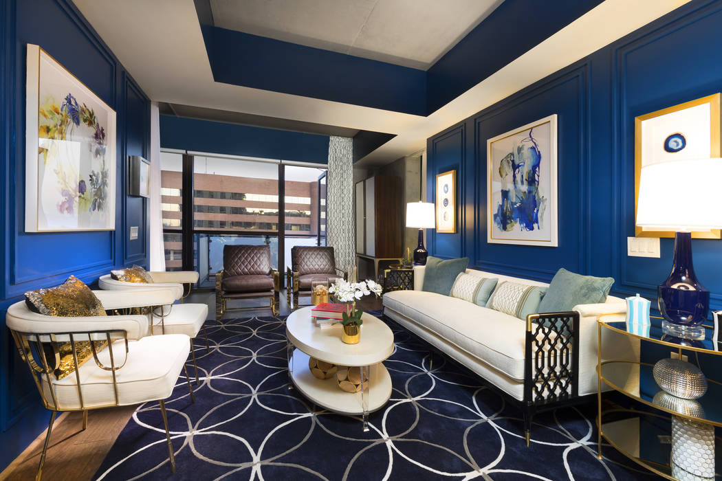
Lee Bryan is the owner of Atlanta-based Lee Bryan Interior Design LLC. He has done work on model condominium units inside The Ogden, Juhl, One Las Vegas and Veer Tower. The designer emphasizes that going eclectic requires more accenting instead of trying to balance equal amounts of two styles.
“You can mix an antique picture in a contemporary home, but the focus is more as an accent piece versus a 50-50 blend. That never works well. It just looks like they’re fighting each other, or like you couldn’t make up your mind,” he said.
Bryan likes to incorporate a design element that ties elements together, too, such as a certain wall color throughout a home or a type of wood finish. You can branch off of that common element with a variety of accents from different eras.
“That thread helps it all seem less like a thrift store. It could be a wood character … upholstery, fabric,” he said.
Sarah Barnard, principal of Sarah Barnard Design in Los Angeles, advises clients to be aware of “cognitive overload.” Eclectic should come in touches, splashes, not in large pieces that overtake a room or compete with another aesthetic.
Minimalism as a base
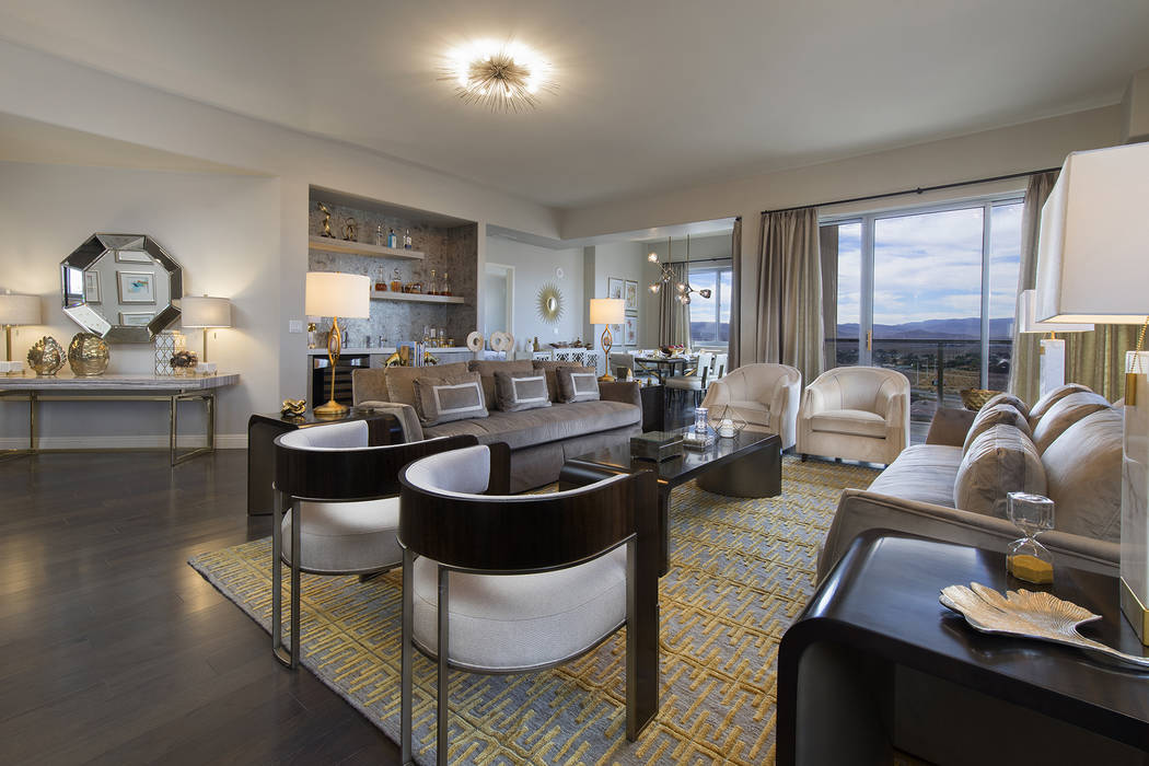
When it comes to background color, a “neutral white space” can be the perfect base for eclectic accents or “curating a collection of exceptional objects,” Barnard said.
“Just as in a gallery setting, neutral walls recede and allow the unique attributes of the group to be appreciated. … I encourage my clients to display art collected from their travels along with heirloom family pieces. … Our homes are a portrait of sorts, reflecting where we’ve been, who and what we care about most,” she added.
Michele Aloe, Las Vegas showroom manager for tile and stone company Walker Zanger, sees the use of “elemental design,” a clean but tactile look found in this year’s New American Home series, as a good backdrop for eclectic accents.
In these settings, with lots of gray and a sense of being close to nature, her team might accent with turquoise or its Deep-sea Blue tiles. She has seen some homeowners use animal hides or prints as sharp contrasts.
“It’s a very clean line design, and all of a sudden you get something completely out of the box like that,” she said.
Unique spaces, gallery walls
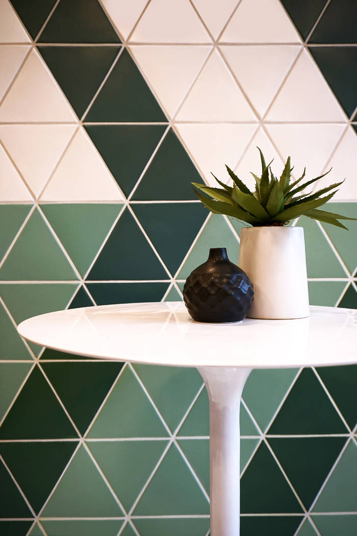
Walker Zanger recently revealed four interior styles to watch for the coming year, one of which it coined “Nostalgic Maximalism.” The bold style embraces the eclectic and merges modern and retro feels, playfully combining colors, shapes like triangles and landscapes. Aloe describes it as a “large print format that’s extremely graphic with bold colors.” The expert appreciates how the style entirely pulls away from the whites and grays in current contemporary designs.
“It’s timeless and makes people feel good. … It’s a little more whimsical and not so serious,” she added.
Aloe said small spaces within a home are good for experimenting with an eclectic theme or just something different altogether.
“It doesn’t have to be completely themed, but you might want to have that space where you respect that journey you made to Asia,” she said. “Theaters are areas where people will do something different as well. They might have a popcorn machine with bar stools and unique countertops in a space to sit and watch the football game.”
Bryan also uses entryways for opportunities to create deliberate contrasts. He might put a secretary’s desk or an ornate console table from a different era there or a Venetian glass mirror, nodding to the past alongside contemporary flooring and trim.
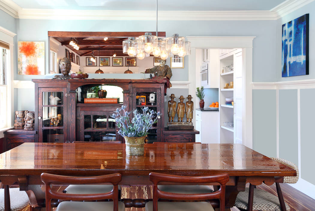
Bryan also said gallery walls are a perfect place to add eclectic touches. You can easily mix in traditional art, photos and a variety of frame types from clean and simple to some with an older, more ornate look.
“This way it looks like you acquired things over time versus having it made to match. It’s more like a collection than a ready-made package,” he said.
Mid-mod, art deco, Arts and Crafts
Bryan said that a lot of midcentury modern furniture, which often uses maple wood, lends itself to being an eclectic accent in contemporary environments. He uses certain shapes in the furniture style, like the legs of a chair, for example, as consistent tie-ins throughout an interior or as accents in other spaces of a home.
For Barnard, Arts and Crafts homes, which were departures from Victorian industrialization, actually fit well with contemporary design or mid-mod furniture. Barnard doesn’t mind throwing in a dash of Victorian-era art as well.
“While the artistic movements may have fundamentally opposing design principles, they co-exist beautifully in modern life,” she said.
Bryan also likes to weave art-deco pieces into contemporary environments. Both have similar clean-line aesthetics, he said, while still distinguishing their eras. Gilded art pieces can work as stand-alones but do not try to blend furniture with a gilded look into a modern aesthetic. It’s just too large and conflicting, he added.
Have fun, be yourself
Ultimately, making eclectic design choices requires its share of rule-breaking.
“The greatest thread in the curation of eclectic interiors is joy,” Barnard said. “If the objects we surround ourselves with fill us with delight, they will inevitably be visually cohesive because they reflect our personal histories.”
There are no hard and fast rules about juxtaposition, she adds. “Often, the most unexpected combinations are the most delightful.”
Aloe offers a similar sentiment to these more daring design times.
“It seems like there aren’t any real rules anymore. People are kind of throwing everything together, wood, glass, metal, quartz, mixed with porcelain,” she said.
“If your home is what makes you happy, then OK. … A few years ago, everyone was building to sell, so the thinking was ‘what do people want to see so I can sell it?’ Now we’re getting more renovations. … You have to deal with what’s there. You have to be more forgiving in your style and allow that eclectic quality to be somewhat dictated by the original architecture of the home.”


