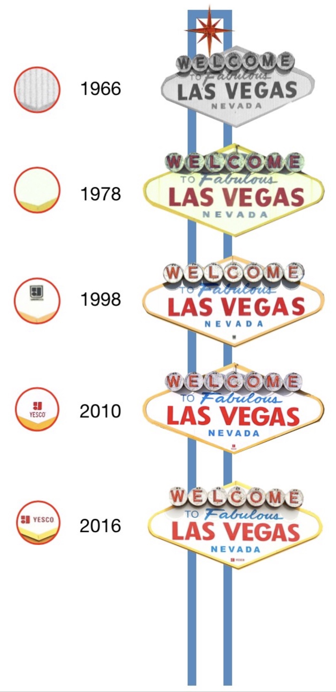
How the Welcome to Las Vegas sign has changed over the years
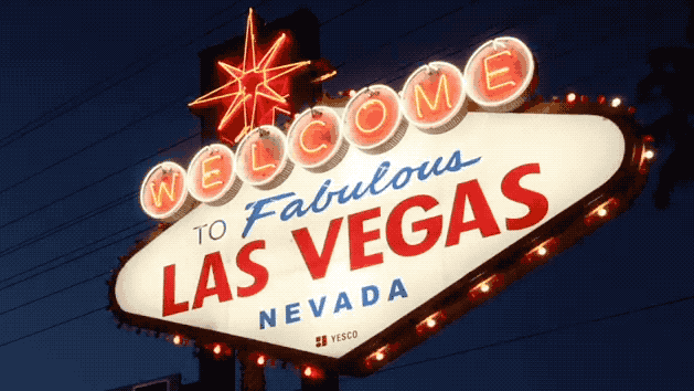
The "Welcome to Fabulous Las Vegas" sign you see today isn’t exactly the original.
Perhaps that’s to be expected in a desert where violent winds and blistering sunlight can take a toll on any plastic, but it may surprise visitors who pose with one of the most photographed signs in the world.
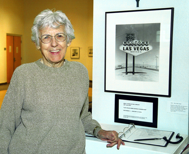
First, some backstory: when it was erected in 1959, the sign was not immediately celebrated. The designer, Betty Willis, told the Review-Journal in 1998 that as the sign became outdated, she grew "squirmish" about how long it stayed up.
Clark County officials discussed tearing it down in the early 1970s, but locals objected. By the late '90s the sign became stylish again. With the advent of digital cameras and the sign's appearance on commemorative license plates, its fame took off and sign-related kitschy items became souvenirs.
In 2004, the Nevada Department of Transportation prompted people to photograph the sign from afar, saying that adding a crosswalk would make the site more dangerous.
"It would encourage more people," Public Information Officer Bob McKenzie told Las Vegas CityLife. "It's not a destination point where people should be going."
The next year, The New York Times said that the sign surpassed "fur dice in the iconographic pantheon."
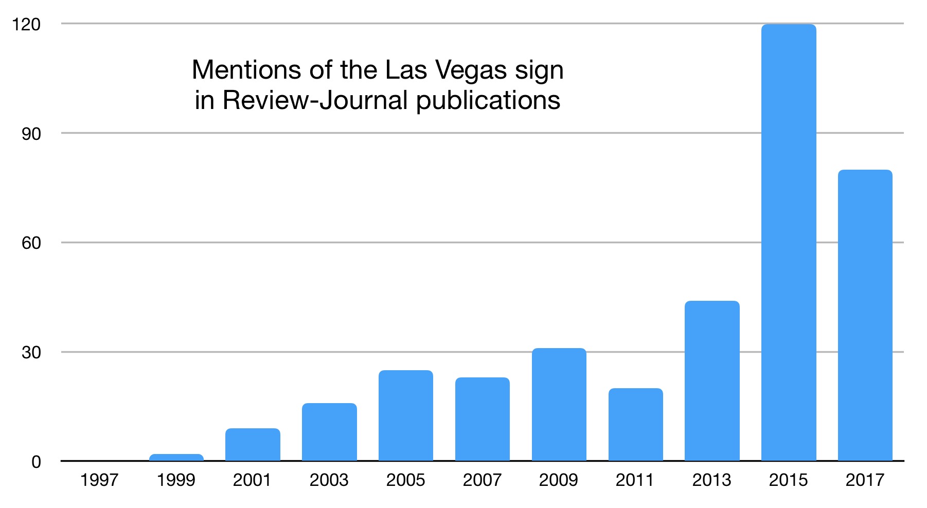
Because the sign's prominence is relatively recent, little history about it exists. Tracing its changes meant studying the handful of vintage public photographs that exist. The icon is barely (if at all) mentioned in local history books. Even the Review-Journal's archive ignores it. The newspaper's pages mentioned the sign only a few times a year until around 2001.
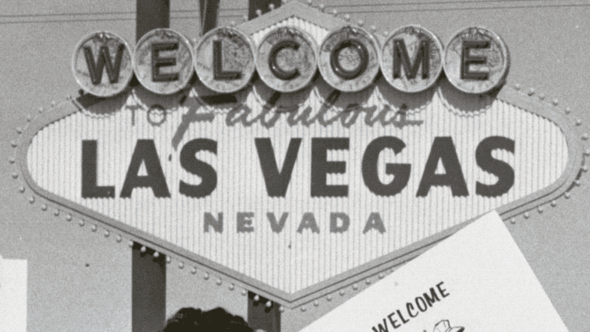
It may be simpler to start with what hasn't changed. Young Electric Sign Co., which owns the landmark, said the metallic infrastructure – blue poles, red star, yellow frame, and seven silver dollars – is likely original.
What’s not as antique? The famed red, white and blue face.
In historic photos, the face appears pinstriped. That's because the acrylic was corrugated to keep it rigid, YESCO’s senior vice president, Jeff Young, said.
On the original sign, the foot of the "F" was extended as well. (Willis said she never was satisfied with the handwritten "Fabulous" scrawl.)
The precise date of the sign's first plastic surgery remains unclear; however, the stripes were gone by the time a 1978 photo was taken.
Young told me he doesn’t know how many times the sign has been altered. The latest face transplant, he said, occurred circa 2009. On separate occasions, the sign was vandalized with a marker, splattered with paint and cracked by a rock. A new face proved the fastest fix after attempts at repairs.
He said he’s sure no one from YESCO took photos or videos of the transition.
“The county was very anxious about getting it done,” Young said. “There was a bit of a fervor.”
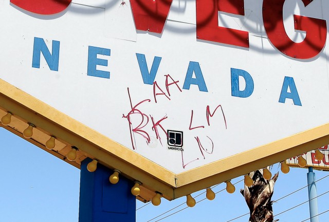
Another noticeable change to the sign involves YESCO’s logo.
When the sign was built, there was no trademark on its face. (YESCO acquired the sign in the early 1960s from Western Neon.)
A small, black YESCO logo appeared by 1998. Around 2010, the logo grew beyond its outline and changed to red. Six years later, the YESCO name moved to the right of the icon in a font three times as large.
Just because the logo changed doesn't mean the sign got a new faceplate. Young said YESCO was careful about preserving the sign as much as possible.
I can't help but wonder what became of the sign's previous faces. They would undoubtedly be valuable collector’s items. Young said he’s sure the last version of the sign’s face was discarded. As for the original? Who knows.
One other perceptible change to the sign involves the electrical box and tubing which hug the left leg. Painted a matching blue, the box appeared by 2002. Today there are four boxes on the same leg, a noticeable metallic gray.
What other changes might the sign have seen? Perhaps its location. A Review-Journal article from 1998 stated that the sign moved south several times to remain on the outskirts. However, the sign's 2009 registration form with the National Register of Historic Places stated "there have been reports that the sign was moved" but said there is no documentation of that with Clark County or YESCO.
Send your questions and feedback to hkeely@reviewjournal.com and follow me on Twitter: @HarrisonKeely.