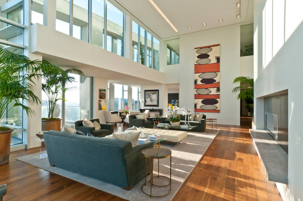
Heavy mirror, artwork would not work on tall wall
Dear Gail: We have a large, tall wall that is about 20 feet long by 8 feet high that we walk underneath when coming from the entry into the family room. We also see it when going upstairs. We’re stumped on what to do with it but thought mirroring it might be a good idea. We don’t want to leave it blank. What are your thoughts on the mirror? Or are there other options that would work better? — Danielle
Dear Danielle: If I understand you correctly, the wall is the outside wall of one of your rooms on your second floor, so when you are walking underneath it, you are walking under the floor of this room. I’m going to make this assumption.
Since you mentioned that you walk underneath this area, I would not place anything too heavy in visual weight as it would give an uneasy feel to walk underneath it. With artwork, you always want to be able to ground the artwork to the floor with either a piece of furniture, a grouping of plants or a floor accessory, so that it doesn’t appear to be floating on the wall. Since we are not able to do this, if you placed anything that was visually heavy on the wall, such as a large framed piece of artwork, it would give an uneasy feeling and make some people wonder what would happen if it came crashing down.
Mirroring the wall would not be something that I would consider for a couple of reasons. First, with the size you’re looking at, it’s going to have a heavy visual weight. Second, what will you be reflecting?
Mirrors have a functional value first and then a decorative one. You always want to consider what a mirror is reflecting. Since the wall is up so high, I’d have to assume you’d be reflecting another wall or upper windows. If you needed light in the area or going upstairs, windows would bring in the reflective light from the mirror, but I’m sure you have lighting going up the stairs to turn on. If there is just a wall across from the mirrored wall, you’d be reflecting a blank wall. With any mirror, always look at what it is reflecting.
One lightweight option is to use canvases. Since your wall is 20 feet long, I would do two to three panels where the image flows over the multiple panels. Using two panels (what we call a diptych) or three panels (a triptych) gives you a larger piece without feeling blocky.
There are many websites where they can resize an image to what you need. You’ll want the edges to be a solid color. Otherwise, if the image is wrapped, you’ll lose the continuity. I’d opt for a black side as I feel white looks unfinished.
Depending on your style, you can use a tapestry. It’s visually lighter in weight than a framed image. Tapestries come in all sizes, colors and themes. You could hang a larger horizontal one and then place a wall pocket on each side of it filled with airy ivy greens. Even though the greens will be hanging down on the wall, they have a light visual weight and will help soften the wall along with adding some color, texture, and dimension.
Place the tapestry on a decorative drapery rod and accent with a pair of beautiful tassels on each end. If you don’t find a larger tapestry, use three coordinating vertical ones on separate rods.
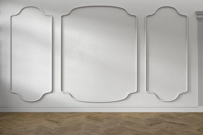
One of my favorite options is to use molding. What I like about it is that you have unlimited design options. There’s even flex molding, as pictured. With the length of your wall, I would create three panels.
For a simple design, do three frames and paint it the same color as your walls. If you want more interest, paint the inside or molding a different color from your walls. If you’re going to paint the inside a different color, you’ll want the molding to be a contrast from your walls, so you don’t lose the design. I would suggest white if that is the color of your baseboard.
You could also place something inside the frame. Lightweight metal pieces would work nicely, being they are thin. I would use identical design with an open pattern. Otherwise, it can feel too heavy. Depending upon your style, you could also inset wallpaper.
With tall walls, you need to be careful about your choice. What you place there needs to be big enough but still have a light appearance.
Gail Mayhugh, owner of GMJ Interiors, is a professional interior designer and author of a book on the subject. Questions may be sent by email to GMJinteriors@gmail.com. Or mail to 7380 S. Eastern Ave., No. 124-272, Las Vegas, NV 89123. Her web address is www.GMJinteriors.com.


