Pandemic still influences 2022 colors of the year
In the fourth quarter of every calendar year, the Pantone Color Institute and all major paint manufacturers unveil their colors of the year. Designers and experts then spend the next few months weighing in on why certain colors and palettes were chosen, and how these choices reflect on society and design trends.
This year’s hues still undoubtedly reflect the pandemic’s impact. As color experts explain the 2022 choices, many speak to our desire to become less anchored by our environment or situation and to get out and enjoy nature. Here, a few experts share their thoughts on five different colors of the year, how they’re a reflection of our world today, and where we may see them in Las Vegas homes going forward.
Purple and green dominate 2022
Often viewed as the color authority, the Pantone Institute opted for a distinctive violet with its Very Peri. The hue’s blue serves as an anchoring base with an added red influence symbolizing a need for risk.
Very Peri “displays a spritely, joyous attitude and dynamic presence that encourages courageous creativity and imaginative expressions,” said Pantone’s Executive Director Leatrice Eiseman.
Very Peri speaks to today’s drive to do something creative, but still feel safe, according to Dak Kopec, coordinator of the Master of Design Program at UNLV. He sees the same theme with the many green colors of the year from PPG, Sherwin-Williams and Behr. They invite creativity, but still seem grounded and earthy. Greens also mix well with purple, Kopec added.
“Purple is a blue and red … and green is a blue and yellow, these colors are complementary and go together nicely,” he explained.
Sherwin-Williams’ Evergreen Fog is described as a “chameleon … green-meets-gray, with just a bit of blue.” A slightly darker green, Evergreen Fog can be both subtle and make a statement as well.
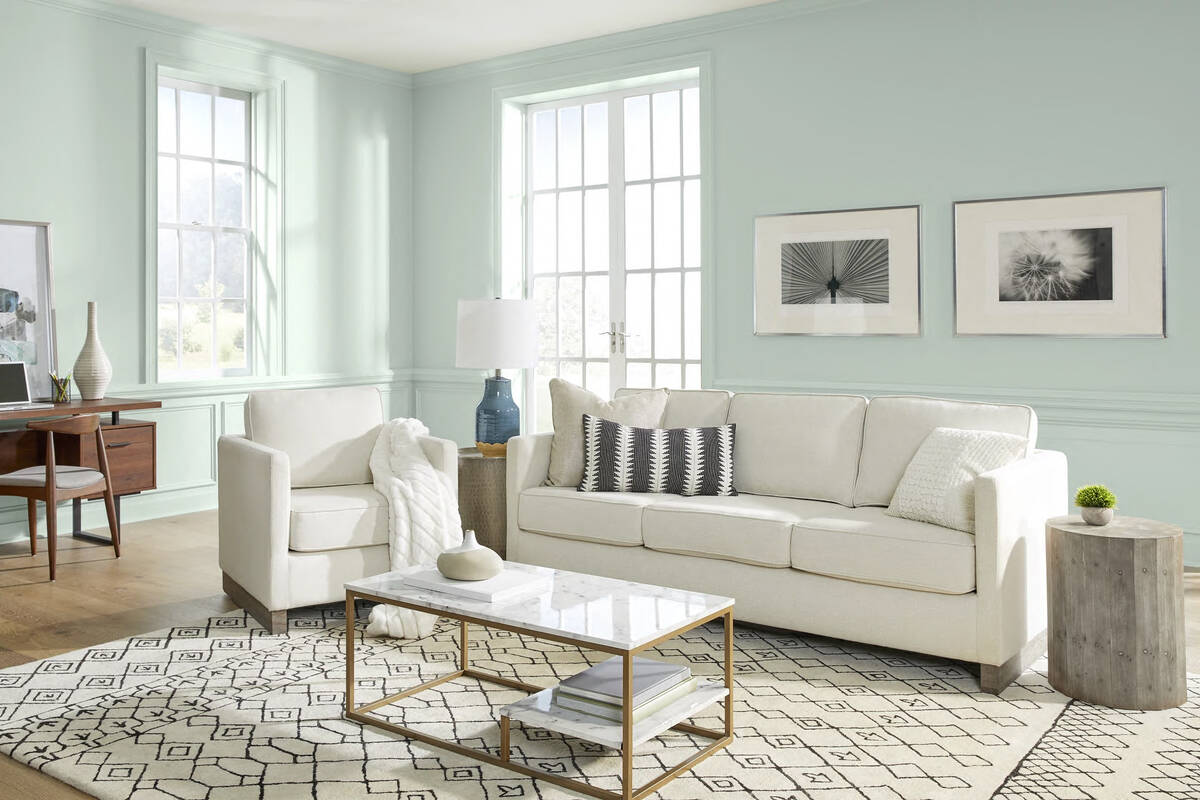
Behr’s Breezeway is very light and described as an “uplifting sea glass green” that mixes well with white, gray and wood tones, according to the manufacturer. In terms of darkness, PPG’s Olive Sprig lands right in between Evergreen Fog and Breezeway. PPG calls it a “grounded … and highly-adaptable grey-green.”
“I think people want to be untethered. They’re looking to leave but in a safe way,” Kopec emphasized, “which is why you have this eggplant and olive theme; it still has that earthy tone to it. With the greens it’s minty, olive, you’re following a pattern from pastel-y to earthy green.”
Wood accents, Vegas homes
With the greens, Michele Aloe, Las Vegas showroom manager for stone and tile company Walker Zanger, also noticed a lot of wood accents going along with them in the visuals color experts provided. Aloe also noticed the types of woods used with the green colors are shifting to a more natural look.
“For years it was that dark, almost black wood with white, gray and black. … Now, even in our showrooms, we hear people saying ‘that’s not honey enough or cognac enough.’ They want the real natural color of wood,” she said. “A lot of people are liking the addition of natural wood elements like a live-edge table, butcher block counter or even porcelain floors that look like wood. … Those kinds of cool green-grays also work well with those more natural woods.”
Kopec also suspects we’ll see these greens and even purples in accent walls and accent pillows, vases and other decor items in Las Vegas homes and even some experimentation in bedrooms.
“I think you’re going to be seeing the real color coming out of bedrooms. In the master, maybe more of that minty color, maybe in the kid’s room you start seeing the periwinkle interjected. In a home office, you might see periwinkle, too. That’s where people are looking for a sense of strength and power, particularly if they’re still working from home,” he noted.
Appliances, mosaics
Color appliances are a growing trend as well, Dopek said.
Hillary Frei, president of manufacturer Big Chill, sees her share of clients willing to be bold with appliances. Big Chill has a number of green kitchen appliances and even purple refrigerators and dishwashers, resembling Pantone’s Very Peri. It’s the green ones that seem to be stealing the show right now.
“Our Moss Green kitchen appliances have garnered a lot of attention and interest over the past year,” Frei said. “It’s a natural, dark pine tone that can be used as a rich accent color throughout the home. … Right now, I’m loving a dark green-painted kitchen island matched with a Big Chill 30-inch Classic Fridge in a custom green next to all-white cabinetry. I think we’ll see much more of this color combination in 2022.”
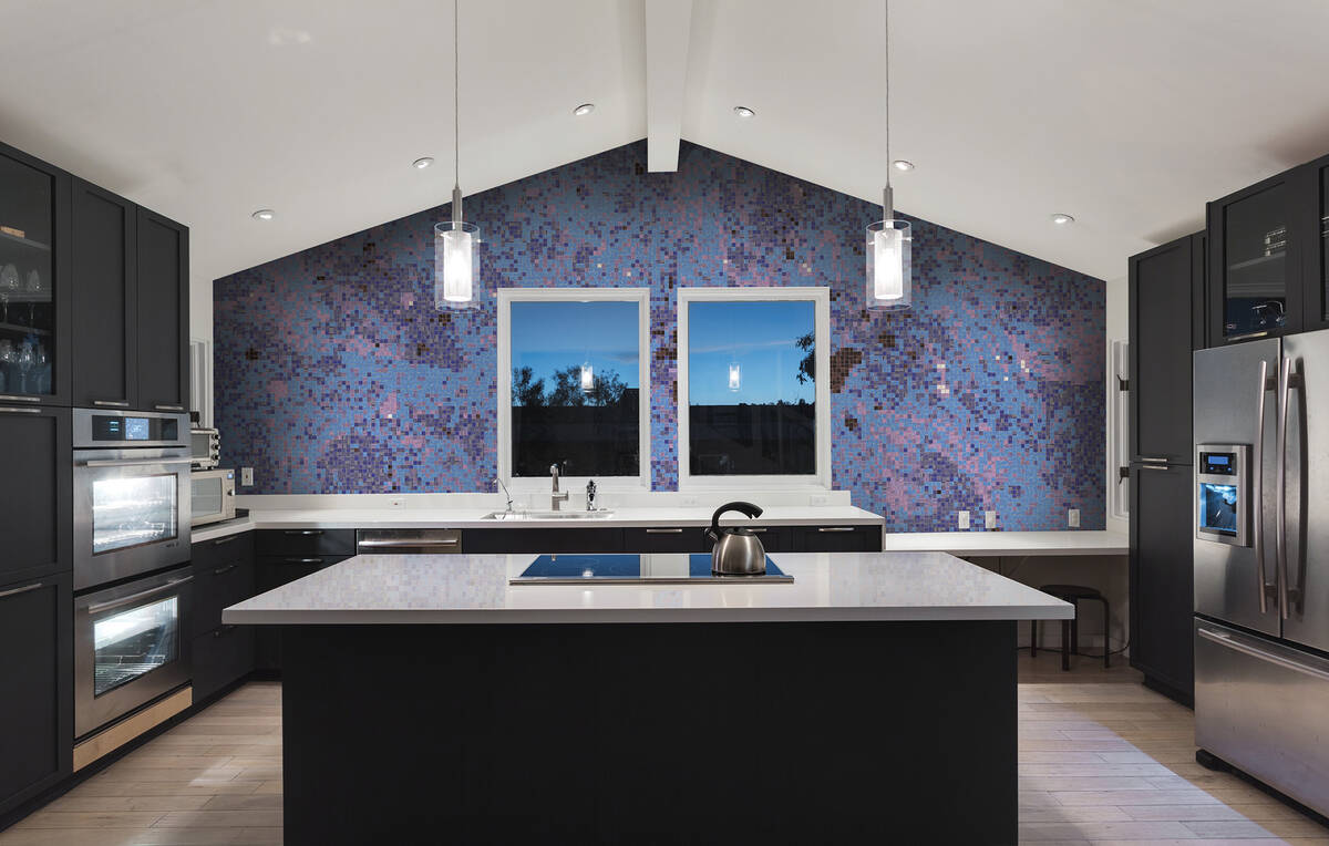
Tile mosaics on walls in homes are another growing trend, and they’re also a great way to incorporate unique colors. Kait Paradowski, design director at Artaic, which uses proprietary software to design custom mosaics for rooms in homes, hears a need for earthy tones and the desire to reconnect with nature in her customer requests. But she also points to a request for happy blues, reds and yellows, those bases and pops inside the 2022 purple and green theme.
“I think there will be a shift for people wanting to surround themselves with positive and joyful colors — golden yellow, Klein blue and bright magenta,” she added.
Woven into stone
Aloe also has seen an emergence of greens and purples in stones as floor and wall tile designs.
“If it’s someone’s overall floor tile or their master bathroom tile, they generally stay a little more conservative,” she said. “We’ve definitely seen a sway away from the cool whites and more toward the creams and beiges, warmer tones.
“But for some who go with more of a white tile, you’ll see a soft green in there, too. … For years it was also that traditional Calcutta marble, white with a sharp gray or a black with it. Now we see something like a ‘Calcutta Manhattan,’ which is more of that sage-y green undertone and it’s not so stark, more calming.”
And hints of purple are even surfacing as well.
“We actually have a lot of natural stones coming from Italy that have a violet kind of purple color woven into them,” Aloe said
A more grounded option
Dunn-Edwards took a different approach with a darker, more grounded brown called Art and Craft. The manufacturer calls it a “nature-based hue that is moody and complex yet versatile.”
The color palette that goes with the brown hue brings in lighter touches, like Dunn-Edwards’ creamy Cotton Club and Gypsum Rose, a light earthy beige with a hint of red. Dunn-Edwards builds out its share of visuals to demonstrate the versatility of Art and Craft, and it lives well among wood, stone and bright contrasting white trims.
Aloe looks to the Dunn-Edwards palettes every year and appreciates the many options the company presents along with the color of the year.
“I like how Dunn-Edwards does their palettes. This one shows you how can go with a warm Scandinavian or other classic looks, and you can take it in so many other directions,” she said.


