What are the color trends for 2023?
With everyone busy making New Year’s resolutions, maybe yours include updates to your home decor. It’s the perfect time to do so, especially since this time of year is when Pantone and the major paint companies announce their colors of the year.
While Pantone does not sell paint, the organization sets the standards for a universal language of color and provides color standards used by brands and manufacturers. This year’s color selections run the gamut — from a vivacious coral shade to a bluish-greenish one all the way to an earthy tone and an off-white choice. Each color selection is accompanied by a palette of coordinating shades.
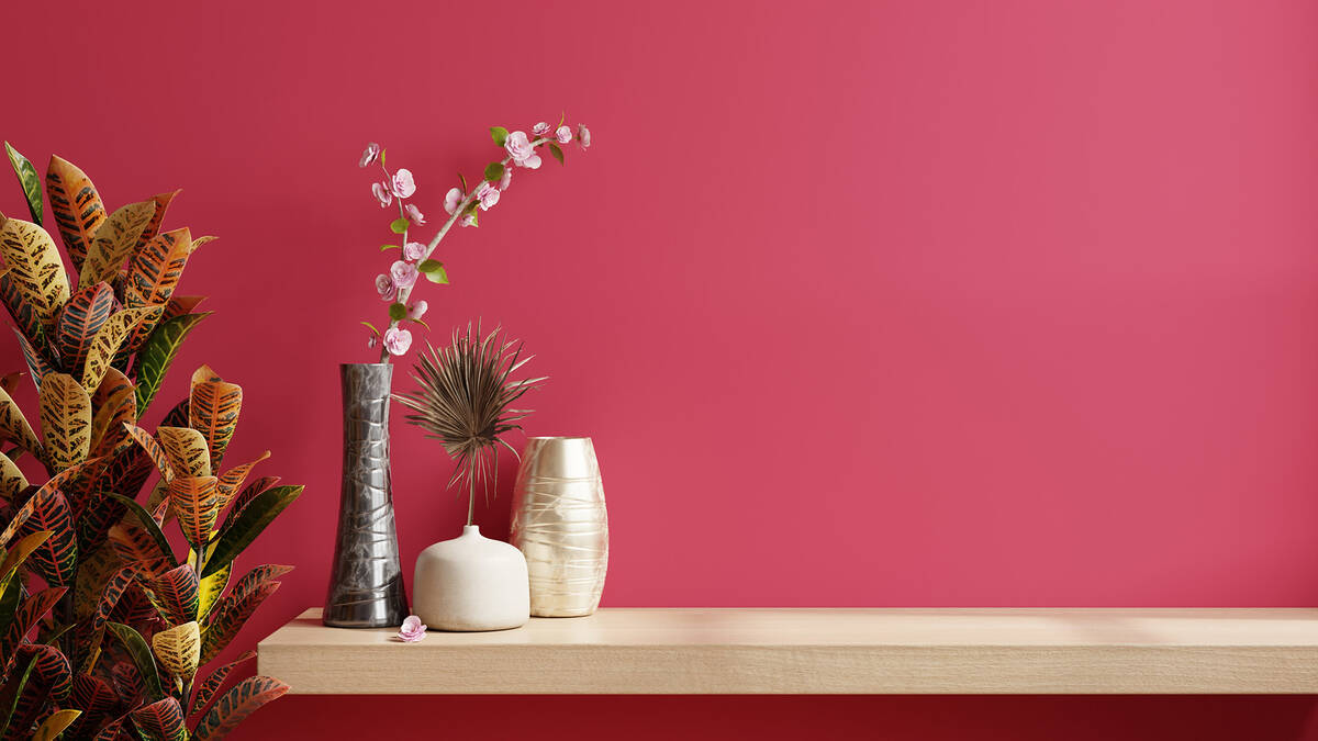
Pantone’s recently announced its color of the year as Viva Magenta, describing it as an “animated red” which is “powerful and empowering.” According to the forecasters at Pantone Color Institute, Viva Magenta “revels in pure joy, encouraging experimentation and self-expression without restraint … an electrifying and boundaryless shade that is manifesting as a stand-out statement.”
According to the institute’s vice president, Laurie Pressman: “It is a color we see crossing all areas of design, a color that serves as an expression of a mood and an attitude on the part of the consumers, a color that will resonate around the world, a color that reflects what people are looking for, a color that can hope to answer what they feel they need,”
Pressman said the members of the institute who weigh in on the year’s color come from a variety of industries, locations and backgrounds and discuss color trends throughout the year.
“We discuss our color psychology and color trend research looking to connect the mood of the global zeitgeist with the corresponding color family. From there, we drill down further to identify the exact right shade,” she said.
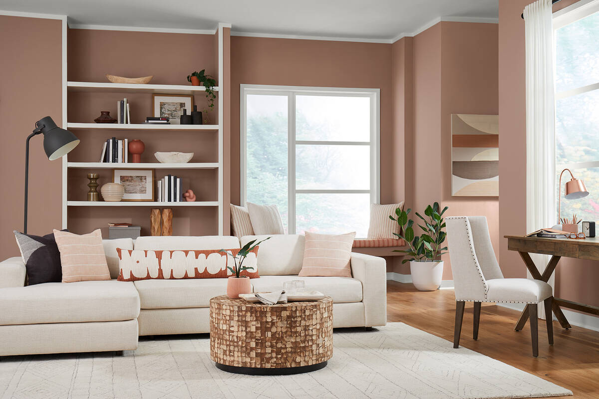
Sherwin-Williams describes its color of the year, Redend Point, as a minimal, calming, intriguing, warm, earthy hue. The color promises “beauty beyond ourselves” with an ability to “embrace a spirit of connection with the world around us with this soulful-yet-subtle hue.” It’s a comforting shade reminiscent of hiking through the reddish, inviting tones of a Southwestern slot canyon.
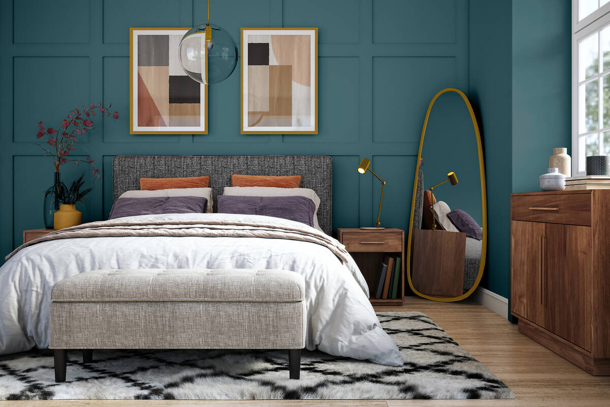
Glidden’s 2023 color of the year, Vining Ivy, serves up “bluish-greenish-something-in-betweenish” versatile vibes in any room. No matter if you think it looks more blue or green — either way, it’s a deep-shaded Caribbean aqua with a turquoise undertone and is muted enough to not feel bright or overwhelming.
According to the website paintcolorproject.com, Vining Ivy has a lot of blue to it but reads as green in many spaces. While it can be used in virtually any setting, it pairs well with white, terra cotta, warm browns and muted jewel tones.
Benjamin Moore has announced its annual pick as Raspberry Blush, an optimistic coral tinged with pink. It is inspired by an artist’s desire to communicate through color, shape and sound.
According to the company’s website, “Raspberry Blush is the definition of charismatic color. This unapologetic shade of red-orange had us thinking: bold, bolder, boldest.”
The Benjamin Moore website even includes a song with electro-funk duo Chromeo to “underscore the upbeat and optimistic tone of the palette and the dynamic role color plays in self-expression — much like music.”
Behr’s Blank Canvas paint is an off-white shade with complex undertones of brown and gray, making it a true neutral. The company’s website describes it as a “transformative hue to clear the way for endless design possibilities and an opportunity for self-care.”
“As we look to 2023, we understand that comfort will still be a driving force behind design decisions and style statements,” says Erika Woelfel, vice president of color and creative services at Behr Paint Co. “Blank Canvas effortlessly offers a clean and inviting blank slate that allows individuality and creativity to flow freely.
“This white easily harmonizes with a wide range of hues, including neutrals, earth tones and pastels for a charming and cozy appeal. Blank Canvas also pairs beautifully with black for a dramatic impact, and with bright accents like green or cobalt blue to instantly lift your mood.”
Behr Paint Company’s Global Chief Marketing Officer Jodi Allen said, “White paint colors are our top-sellers at Behr. With so many options to choose from, we wanted to spotlight the one that we believe is most versatile, and truly the perfect shade of white for any project.
“In addition to inspiring renewal, positivity and a sense of calm, Blank Canvas always makes a design-forward statement, whether you’re a homeowner working on a DIY living space, or a professional painter seeking your go-to white to use on countless projects for years to come.”
The new shade joins the lineup of Behr’s Designer Collection palette, a line of specially curated hues that work for home interiors and exteriors. Allen shares that her team chose Blank Canvas as the latest color of the year following countless hours of discussion and research.
After polling 1,000 homeowners across the country, Behr learned that participants found white walls to be “mood-boosting, uplifting and helped people focus,” Allen said.
What do the experts in the home design field think of this year’s picks and what’s their advice on how to insert these colors into your decor? Whether you choose to actually paint a room or simply a wall or just add some accessories to use these top-of-the-moment colors, there are a multitude of ways to add them.
“The 2023 colors are all very saturated colors,” said Las Vegas designer Peggy Scinta of P. Scinta Designs. “In my opinion, Pantone and Benjamin Moore are projecting happiness and hope with their vibrant pinkish colors (which I love pink, so I am happy about that). I would see these more feminine colors being used as accents, pillows, accessories … and for the very bold and adventurous, why not a special piece of furniture in a somewhat neutral space … perhaps an occasional chair with a whimsical, colorful pillow?”
Nestings Home Staging and Interiors owner Susan Thomas said, “I suspect that after a few dismal years and breaking out of the gray era, we are starting to invite bright luminous colors into our lives to say, ‘Hey, we’ve shown we are up for any challenge, and we are ready to wrap ourselves up in bold, magnetic colors as if to say, bring it!’”
Scinta commented that she recently viewed a presentation from Thibaut, one of the nation’s oldest designer wallpaper firms, and they showcased some papers in tones similar to Vining Ivy. “Vining Ivy is a very intense color as well, and I would see this used as an accent wall or in a powder room for a very dramatic effect.”
She also noted that the Sherwin Williams earthy color is more suited to the desert communities where a warm, clay-toned color works well with our environment. “I could see this used on furniture, but also as an accent. Redend Point is a calm, natural color, and I could see it on an upholstered sofa sitting in front of a large wall of windows as this color plays well with the greens of nature.”
“As a designer,” Thomas said, “I still would tend to keep my overall canvas in a room somewhat neutral except for maybe a Vining Ivy green sofa, which can be very versatile, and add all these other beautiful magenta and raspberry hues in my accent rugs, artwork, throw pillows and throws, and beautiful vases of fresh flowers with these colors. 2023 is definitely going to be fun!”


